How can we make the art gallery experience more inclusive and accessible for all?
Art, it is said, has the ability to meet us where we are, mentally, emotionally, and even physically. But what if that art remains inaccessible to us?
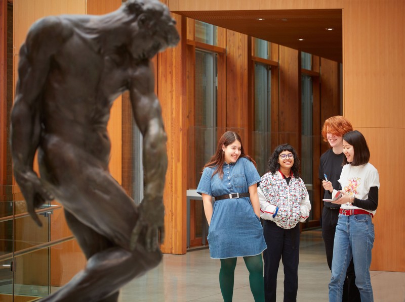
This is a question that surfaced many times since I became a tour guide at the AGO, one of Canada’s largest art institutions. Galleries and museums are not known to be the most accessible of institutions at the best of times, and this goes even beyond the notion of snobbery. What I quickly learned in my time as a guide, was that the AGO was particularly guilty of being inaccessible to many of it’s visitors.
Research
Competitor Analysis also revealed key accessibility features to include and additional gaps that could be addressed within the prototype.
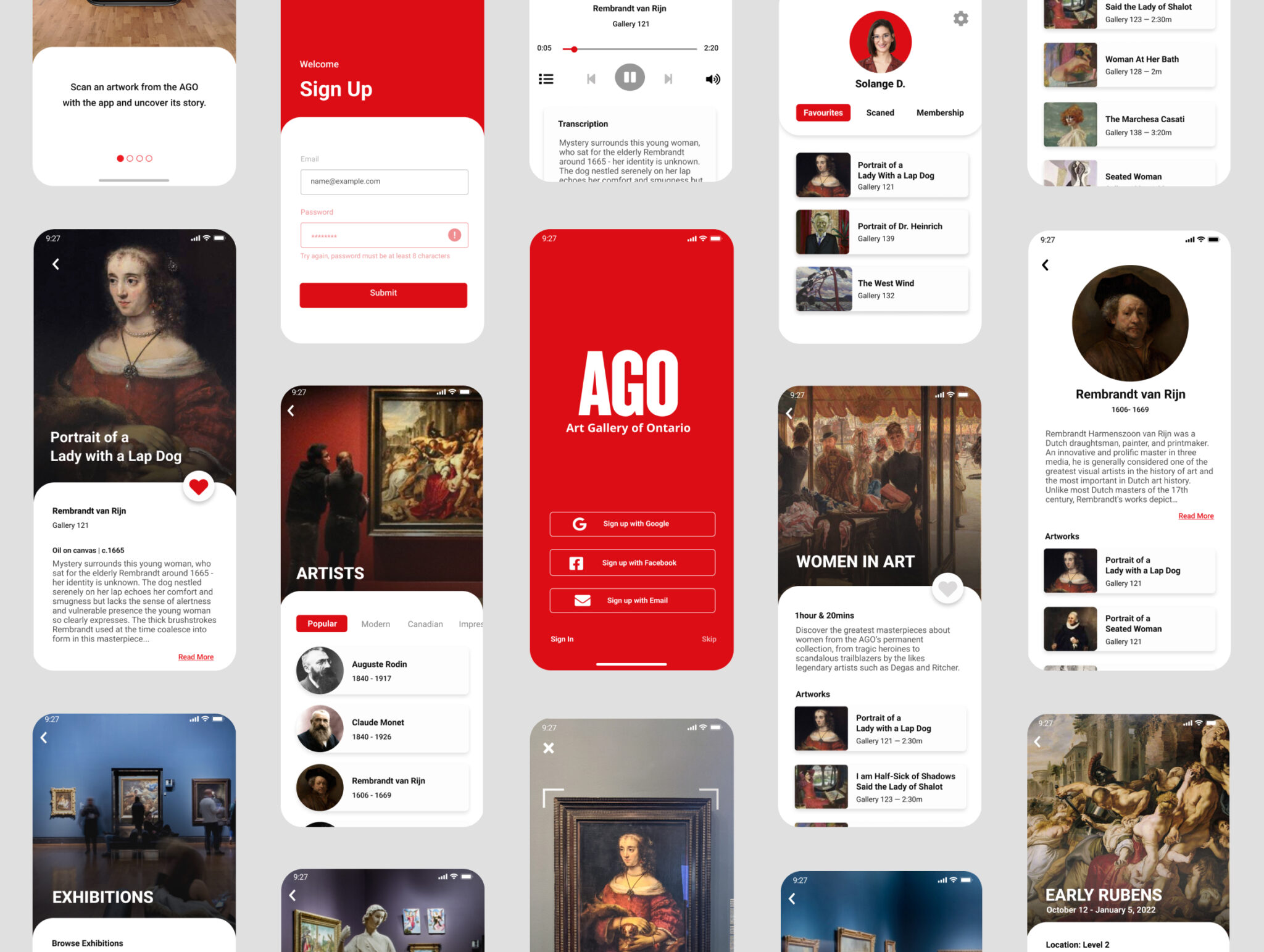
Smartify is an app that uses your phone’s camera to scan an artwork on display and pull up information about the artwork from its wiki-style database. The app also features pre-built tours and audio guides but caters only to high-profile museums like the MET and the Louvre.
The Vancouver Art Gallery and Musée des beaux-arts’ de Montréal include many useful elements such as a gallery map, hours, FAQ, and connection to your gallery membership account.
User Interviews
I planned and conducted 13 user interviews to understand the opportunities and challenges of navigating the gallery, learning about its artworks, and obtaining other
accessibility services.
The combination of research interviews and competitive analysis revealed a few key ways the app could improve the visitor experience:
Address major accessibility concerns for visually and auditorily impaired visitors, with descriptive text and audio.
Cater to the large demographic of visitors who like to navigate the gallery independently, without interacting with staff.
Reduce visitor’s dependence on Customer Services, Tour Guides, and Security to navigate and learn about the gallery.
"The art was great but the signage is terrible." — Google Review
"The art was great but the signage is terrible." — Google Review
PRODUCT STRATEGY
After synthesizing my findings and looking at the timeline, I identified 3 distinct product opportunities to action on when building the prototype.
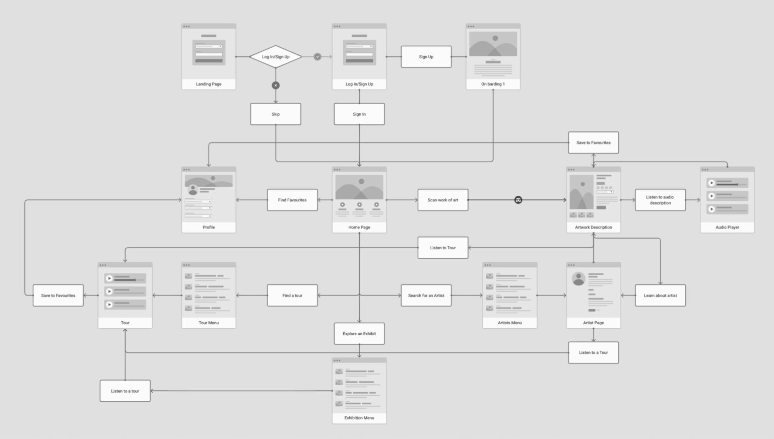
I mapped out in a user flow how artworks would be scanned and discovered, along with other critical interactions such as onboarding, mapping, and more.
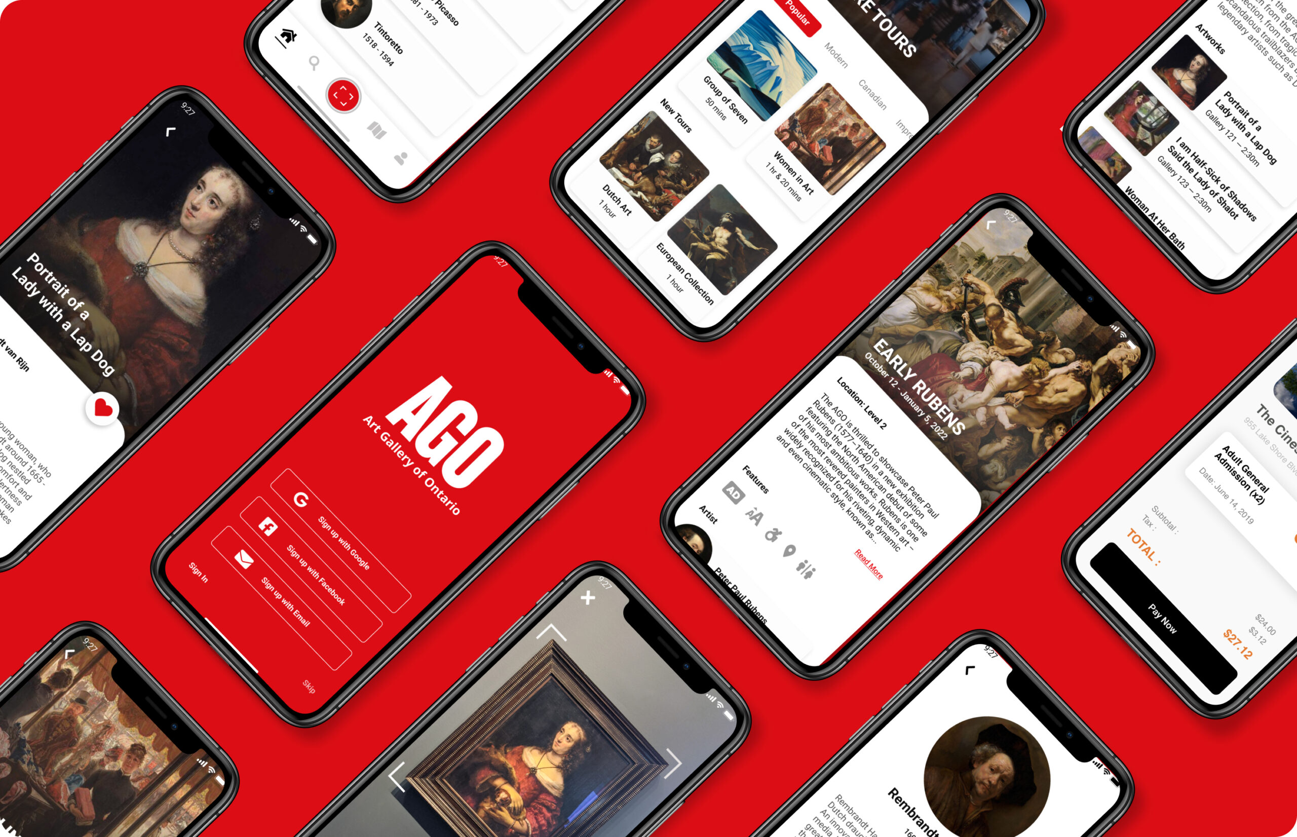
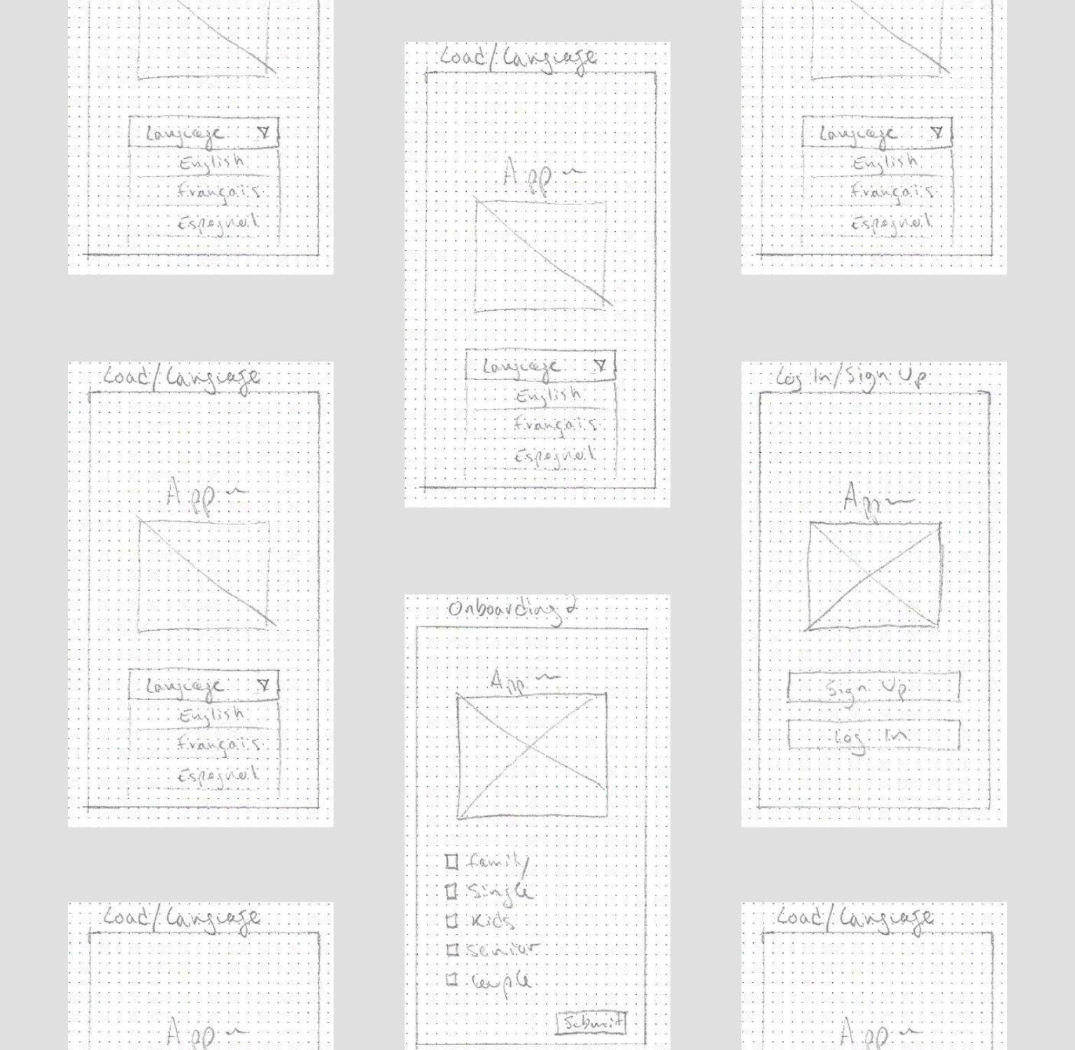
Next, I designed a series of low-fidelity wireframes for key screens based on my user flow. Ensuring all the accessibility features reside in the AGO app eliminates any risk of there being gaps for both disabled and non-disabled visitors.
PROTOTYPE, TEST, & ITERATE
Conducting a usability test with 3 AGO visitors helped me refine the functionality of the app’s main user flow, and reduce friction for the user.
Some of the accessibility features, like the ‘increase text’ were said to be too prominent and distracting.
Users wanted a more familiar UI experience for the nav bar and camera mode screens.
Some users wanted to access their location in the gallery or that of the artwork from any screen.
OUTCOMES & LESSONS
I took what I learned from the user testing on the low-fidelity frames and iterated the app’s final UX.
I simplified and updated the content for the scan and artwork screens’ flow, displaying the accessibility features in a smaller size and more discreet location on the page.
Through out this process, I learned that accessibility and inclusivity are critical aspects of UX, and can better serve non-disabled users just as much as the disabled ones. Understanding the patron’s key pain points and needs was the impetus for several features within the app.